How to fit more on a printed page without making it unreadable

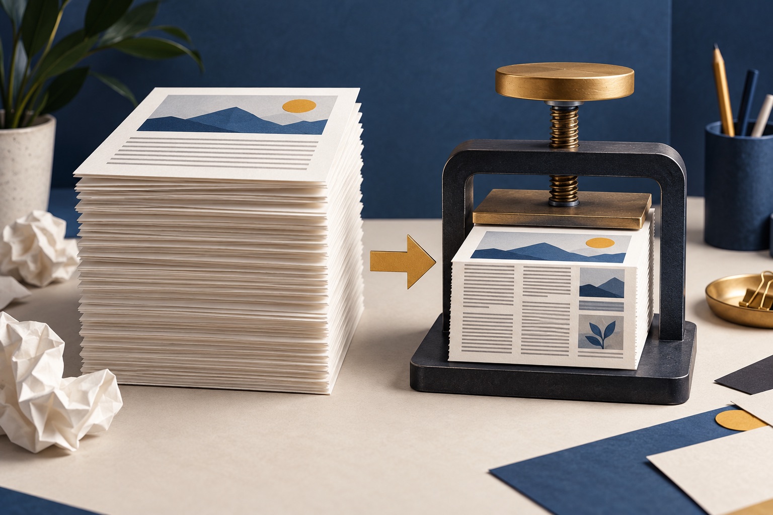
Cut the margins first, since it is free: moving from one inch to half an inch adds about 28 percent more text area on A4. Then drop the scale to 90 or 80 percent, and only then consider two pages per sheet. Keep body text at 9pt or larger for anything you will read continuously.
See the tools in action
Every lever that fits more on a sheet costs you something in readability, but they do not cost the same amount. Margins are nearly free. Scaling is cheap. Pages-per-sheet is expensive. Apply them in that order and you can usually halve a document before anyone notices.
Start with the margins, because they cost nothing
Microsoft Word ships with one-inch margins on every side. On A4 that leaves a text area of 15.9 by 24.6cm. Switching to the built-in Narrow preset of half an inch gives you 18.5 by 27.1cm, which is 28 percent more text area for no change in type size at all. A twenty-page document becomes about sixteen.
The catch is binding. If the document will be hole-punched or stapled, keep at least 20mm on the bound edge. Word has a Gutter setting under Layout → Margins → Custom Margins for exactly this: it adds space on the inside edge only.
Then scale
Browsers and PDF readers both offer a scale control, usually as a Custom percentage from 10 to 200. Because you are shrinking in two dimensions, the content per sheet grows with the square: at 90 percent you fit about 1.23 times as much, at 80 percent about 1.56 times.
| Change | Sheets saved | Readability cost |
|---|---|---|
| Margins from 1 inch to 0.5 inch | About 4 | None, unless you need a binding margin |
| Scale 100% to 90% | About 4 | Barely perceptible |
| Scale 100% to 80% | About 7 | Noticeable, still comfortable for most adults |
| Body text 12pt to 11pt | About 3 | None for most readers |
| Line spacing 1.15 to 1.0, no space after paragraphs | About 2 | Lines get harder to track. Keep some leading |
| Two pages per sheet | 10 | Large. 11pt body text lands near 7pt |
| Two pages per sheet plus duplex | 15 | Same, and you lose the blank back for notes |
Do not stack scale and pages-per-sheet. Two-up already scales each page to about 65 percent; setting 80 percent scale on top of it gives you 52 percent, which turns 11pt body text into 5.7pt. Pick one or the other.
How small is too small
Point size is a measure of the type body, not of the letters, so the practical number is the x-height: the height of a lowercase letter without an ascender. That is what your eye actually reads.
| Point size | x-height | Reads like | Use for |
|---|---|---|---|
| 12pt | About 2.2mm | A large-print book | Anything an older reader will use, or poor lighting |
| 11pt | About 2.0mm | A standard report | The safe default for documents read cover to cover |
| 10pt | About 1.8mm | A newspaper | Long documents in good light |
| 9pt | About 1.6mm | A textbook footnote | The practical floor for continuous reading |
| 8pt | About 1.4mm | A product label | Reference material you scan rather than read |
| 7pt | About 1.25mm | Terms and conditions | Appendices, data tables, skimming only |
| 6pt or below | Under 1.1mm | A medicine leaflet | Not readable for most adults without magnification |
Age changes this table. From about forty onwards, presbyopia makes close focus harder, and anything under 11pt becomes work rather than reading. If you do not know who will read the document, 11pt is the honest floor.
Line length is the lever nobody uses
Typographers have converged on 45 to 75 characters per line as the comfortable range, with about 66 as the ideal. Shrink the type on a full-width A4 page and you go the wrong way: 9pt across an 18.5cm measure gives well over a hundred characters a line, and the eye loses its place returning to the left margin. The smaller type is not what makes it hard to read; the line length is.
So if you are going below about 10pt on a full sheet, set the text in two columns. You get the density you were after and a line length that still works. In Word it is Layout → Columns → Two.
The order to apply them
- Open print preview and read the page countThat is your baseline. Everything below is measured against it.
- Cut the marginsWord: Layout → Margins → Narrow. Browsers: the Margins dropdown → Minimum. Free density, no readability cost.
- Turn off headers and footersIn a browser, Headers and footers off removes the title, URL, date and page number your browser adds, which sometimes recovers a whole line per page.
- Drop the scale to 90 percentCheck the preview. If it still reads comfortably, try 80. Below 80 the type is doing the work that margins should have done.
- Tighten the spacingWord defaults to 1.08 line spacing with 8pt after every paragraph. Set spacing to 1.0 and space-after to 0, and add a first-line indent instead so paragraphs are still distinguishable.
- Only now consider pages per sheetTwo-up is a step change, not an adjustment. It is right for reading copies of academic papers and wrong for anything you will annotate.
- Look at the preview one more timeCheck the last page. Documents that end with two orphaned lines are the easiest ones to shorten by a whole sheet.
Spreadsheets are their own problem
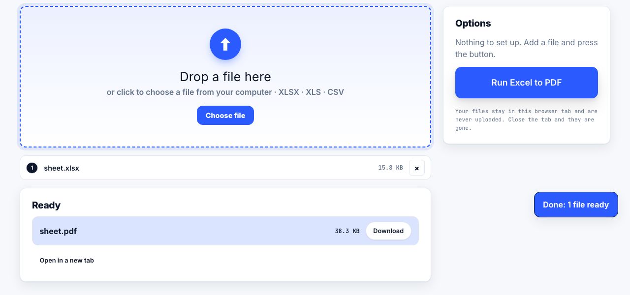
A spreadsheet does not reflow, so scaling is the only lever. In Excel, use Page Layout → Scale to Fit and set Width to 1 page while leaving Height on Automatic. That keeps all your columns on one sheet and lets the rows run over several pages, which is almost always what you want. Set Print Titles to repeat the header row so page four still tells you what the columns are, and switch to landscape before you start shrinking.
Convert a spreadsheet to PDF and check the pagination before you commit paper to it.
Excel to PDF →The cheapest density trick is not printing it
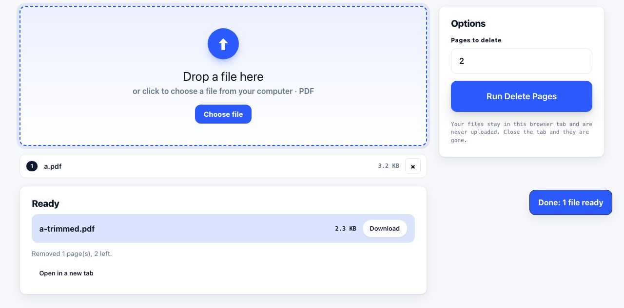
Before optimising the layout, look at what is in the document. Cover pages, revision histories, blank separators, appendices nobody reads and a table of contents for an eight-page report are all pure paper. Cutting four pages from a twenty-page document beats every setting on this page and costs nothing in readability.
Remove the pages nobody reads before you start shrinking the ones they do.
Delete Pages →Once the layout is as tight as it should go, the remaining savings are in double-sided printing and ink settings. For slide decks specifically, handout mode does this job better than any scale control, see printing lecture slides.
Frequently asked questions
What is the smallest readable font size for printing?
About 9pt for text you will read continuously, and 7 to 8pt for reference material you only scan. Below 6pt most adults cannot read comfortably without magnification. If your audience includes older readers, treat 11pt as the floor.
Is it better to reduce margins or reduce the font size?
Reduce the margins first. Going from one-inch to half-inch margins gives about 28 percent more text area with no change to the type at all. Only shrink the type once the margins are as small as your binding allows.
How do I fit a wide spreadsheet on one page?
In Excel, Page Layout → Scale to Fit, set Width to 1 page and leave Height on Automatic. Switch to landscape first, and turn on Print Titles so the header row repeats on every page rather than only the first.
Does printing at 80 percent scale look bad?
No. At 80 percent, 12pt text prints at roughly 9.6pt, which is comfortable for most adults in good light. The bigger risk is the line length: at that size a full-width A4 line exceeds a hundred characters, which is genuinely tiring. Use two columns.
Can I combine two pages per sheet with a scale reduction?
You can, but you should not. Two-up already scales each page to about 65 percent. Adding 80 percent scale on top gives 52 percent, taking 11pt body text down to about 5.7pt. Choose one lever, not both.