How to make your website printer-friendly

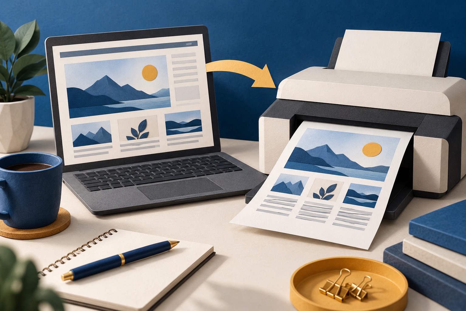
Open your own pages in print preview and fix what you see: hide navigation and widgets, override dark-mode colours, expand link URLs, keep tables and figures whole, load lazy images, and print the page title, URL and date. Most sites fail because nobody has ever looked at the preview.
See the tools in action
A two-minute experiment: open the ten sites you read most, press Ctrl+P on an article page, and count how many produce something you would keep. Usually one or two. Not because print CSS is hard, but because nobody on those teams ever opened the preview.
The whole discipline fits in one sentence: the printed page should be the article, plus enough context to know where it came from, and nothing else. Everything below is a way of failing that sentence.
1. The navigation eats the first sheet
A sticky header, a mega menu and a search box print at full size at the top of sheet one, and a long menu takes the whole sheet. Hide nav, header, aside, footer and anything with role="navigation" in @media print, and the article starts where it should.
2. Dark mode leaks onto paper
The expensive one. If your colour tokens live in a prefers-color-scheme: dark block and your print styles do not reset them, every reader on a dark OS prints a solid black rectangle. It costs them a visible slice of a cartridge and is invisible to you, because your machine is light. Test in dark mode.
3. Links become meaningless
Blue underlined text on paper is noise. Expand the destination with content: " (" attr(href) ")" on external links and reset it to empty for anchors and navigation. On reference-heavy content this one rule is the difference between a printout and a document.
4. Images are missing, or enormous
- A CSS background image does not print unless the reader ticks "Background graphics", which is off by default. Content images belong in an
<img>tag. - Lazy-loaded images below the fold never loaded, so they print blank. Force them in on a
beforeprintlistener. - A hero image takes the top half of sheet one for no gain. Hide it, or cap it at about 60mm.
- Set
max-width: 100%andheight: auto, or a 2000px figure is clipped at the margin.
5. Tables are guillotined at the right edge
A table wider than the text column is cut off silently, with no scrollbar to hint anything is missing. Give wide tables a landscape page rule, reduce the print font size, or at minimum add thead { display: table-header-group } so page two still has column headers.
6. The article is inside a scroll container
Any wrapper with overflow: hidden, height: 100vh or a fixed height truncates the printed document to one page. It is the commonest cause of "the site only prints the first page", and the fix is two lines.
7. You paginate through the middle of things
Figures split from captions, headings stranded at the foot of a sheet, code broken across the fold, a single orphaned line. break-inside: avoid on figures, tables and code, break-after: avoid on headings, and orphans: 3; widows: 3 cover almost all of it, the full rules.
8. The paper has no identity
A printed article that does not say where it came from is worthless as a reference and as marketing. Add a print-only block with the site name, page title, publication date and canonical URL. Browsers add their own header and footer, but readers can switch those off.
9. You send readers to a worse "print version"
A separate ?print=1 page is now usually a downgrade: it goes stale, loses images, forks your analytics and gives search engines another URL to index. A print stylesheet on the canonical page does the same job. If you keep one, canonicalise it back to the article.
10. The pages people actually print get the least attention
Print traffic is wildly uneven. A tiny minority of pages account for almost all of it, and they rarely get design attention.
| Page type | How often it gets printed | What must survive |
|---|---|---|
| Recipe | Constantly | Ingredients with quantities, method, oven temperature, yield, timings |
| Order confirmation or receipt | Constantly | Order number, date, line items, totals, tax, seller address |
| Ticket or booking | Constantly | The barcode or QR code, at a size a scanner can read |
| Documentation and API reference | Often | Code blocks unwrapped, unbroken and monospaced |
| Long-form article | Sometimes | Body text, captions, the URL and the date |
| Terms or policy | Rarely, but it matters | Every clause, numbered, with the effective date |
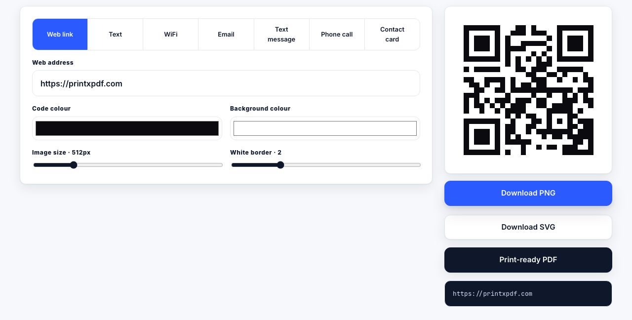
Size barcodes and QR codes properly. A QR code needs a quiet zone of four modules on every side and roughly 20mm square as a minimum for a short URL, 25mm on a tired office laser. Shrunk into a 12mm corner slot it is decoration, not a link.
Generate a QR code at a size that still scans after a laser printer has had its way with it.
QR Code Generator →The checklist
| Check | How to test | Pass looks like |
|---|---|---|
| Nav and widgets hidden | Ctrl+P on any article | The title is at the top of sheet one |
| Dark mode neutralised | Set the OS to dark, reload, Ctrl+P | White paper, black text |
| Single column | Look at the preview | No sidebar, no floated rails, full text width |
| Link URLs expanded | Read a paragraph with links in it | The destination in brackets after the text |
| Images present and sized | Scroll to the bottom first, then Ctrl+P | Every figure appears, none clipped |
| Tables intact | Print your widest table | All columns visible, headers repeated on page two |
| Page identity | Look at the first sheet | Site name, title, date and canonical URL |
| A visible way in | Look at the live page | A print button near the title or at the end |
Why it is worth the afternoon
A good print stylesheet is a good reading stylesheet with the interface removed, so the work overlaps with accessibility, reader modes and anything an assistant reads. It also fixes a quiet failure mode: readers who get nine sheets of clutter never file a bug. They just decide your site is annoying.
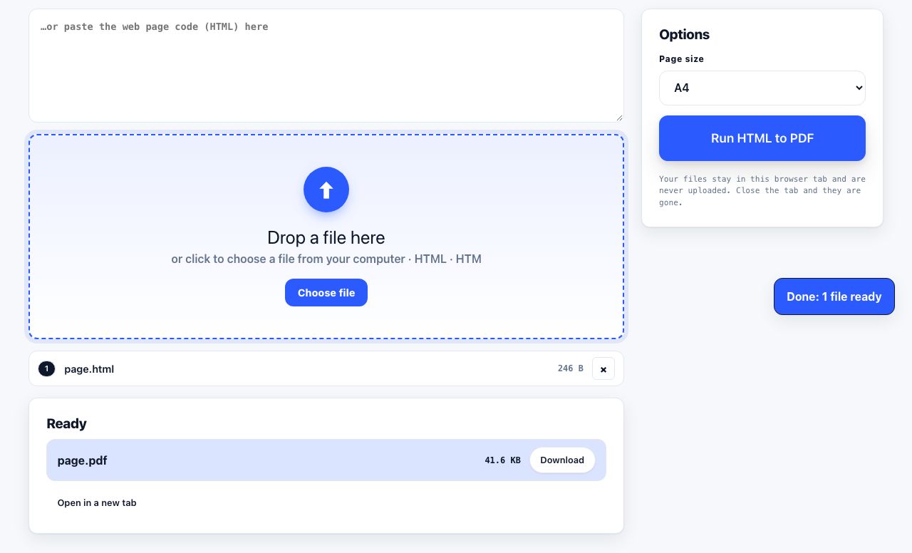
Render your template to PDF and check the result at full size before you ship.
HTML to PDF →Next: the code is in writing a print stylesheet, the button in adding a print button to any website, and on WordPress start with the WordPress routes. Web page printing problems is the same list from the reader end.
Frequently asked questions
How do I test whether my website is printer-friendly?
Press Ctrl+P on your longest article, your widest table page and one commerce page, in Chrome, Firefox and Safari, with the operating system set to dark mode at least once. The preview is the whole test; almost every problem is visible in it.
Do I still need a separate printer-friendly page?
No. A print stylesheet on the canonical URL does the job without a second page to keep in sync, index and analyse. If you already have one, canonicalise it to the article so search engines do not treat it as duplicate content.
Why does my site print a solid black page?
Your dark-mode colour tokens are applied and never overridden for print. Redeclare the background and text colours inside the @media print block, which must come after the prefers-color-scheme block in the cascade.
Should the print button be at the top or the bottom of an article?
Near the title works best for recipes, tickets and receipts, where printing is the point. For long articles, put it at the end as well, since that is where a reader decides the piece is worth keeping.
How big does a QR code need to be on a printed page?
About 20mm square as a hard minimum for a short URL, 25mm to be comfortable, with a quiet zone of four modules of clear space on every side. Longer URLs need more modules and therefore more physical size.